


















The Paga logo is designed to work seamlessly across all types of media. Whenever possible, use the full colour version as it’s the clearest expression of our brand. Black and white versions should only be used when the background or imagery makes the colour logo hard to read. Our system includes PANTONE® colours, a solid colour palette, and reversed logo treatments to ensure the placement stays clear and consistent in any setting.
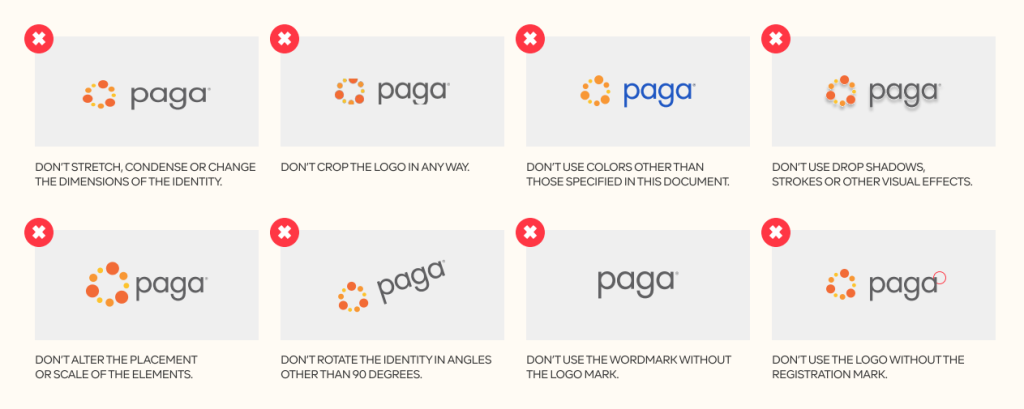
We are conscious of the integrity of our brand identity. It is important to note that no part of the brand identity should be reproduced for any reason.
Here are a few other examples of practices to avoid in the use of the Paga logo.
Colour is a powerful means of visual expression. Therefore, it is a crucial way for Paga to distinguish itself in the marketplace. Using these colours consistently in visual communications will build awareness for the Paga brand.
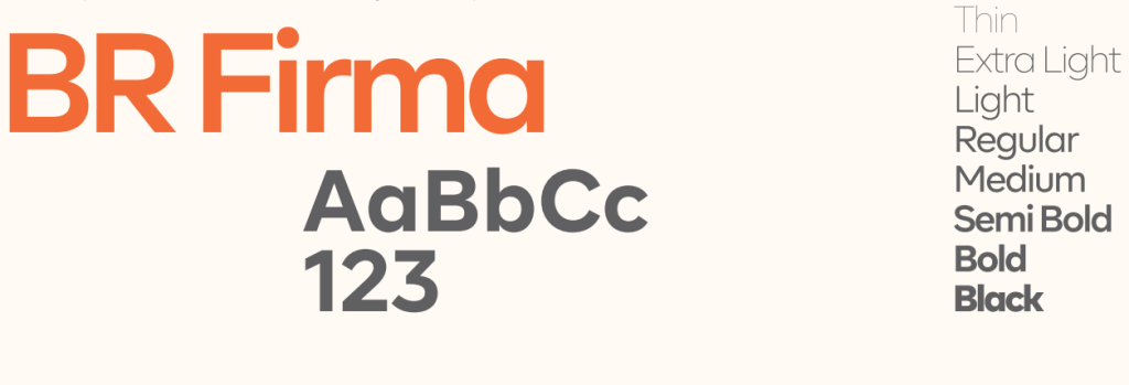
Typography is essential to defining and strengthening the Paga brand. Our primary typeface is BR Firma, which should be used whenever possible.
If BR Firma isn’t available, Trebuchet MS can be used as a fallback only for PowerPoint presentations and similar materials.
Use these guidelines as recommendations, rather than strict rules. The best choice of font weight and size should be based on design judgment appropriate for each communication.
Headlines should be set in BR Firma Bold, preferably in Initial Caps or, alternatively, in ALL CAPS. Avoid tracking type less than -10.
Use BR Firma Bold or BR Firma Regular at a size ratio of approximately 3:2. Avoid tracking type less than -10.
For body copy, use BR Firma Normal at an appropriate ratio and size.